
Friday, May 7, 2010
[Weekly Illustration: The End]
For this weeks illustration I drew inspiration from images of Kali, the Hindu goddess of death. What I found so interesting about these images was the juxtaposition of decoration, suppleness and even serenity with gore and violence. Most of the depictions of Kali show her with multiple arms wielding cleavers and donned with jewelry made of infant pieces. (How metal is that?! I guarantee Mastadon never used that one...) The vintage poster image below was my main reference for this illustration.


Friday, April 30, 2010
Friday, April 23, 2010
[Weekly Illustration: Dust]
Tuesday, April 20, 2010
Thursday, April 15, 2010
[Advice In Progress]
 "Trust Yer Guts" has fleshed out from its initial scribblings. It became sort of quiet and contemplative. I think the addition of the figure helps communicate the message: those rumblings? listen to them.
 My unicorn underwent changes as well. I wanted to convey that offers, opportunities or people that just look too good and sound too great are usually full of shit--or in this case, bugs and gooey yellowish gunk. I'm still playing around with the grunge on the edges, not totally satisfied with that yet. I'm really struggling with the text. I wanted it to feel caterwompus, but at this point I feel like it's difficult to read. Any suggestions?
Thursday, April 8, 2010
[Advice Brainstorming]
 After my initial list-making-adventure, I doodled some initial thumbnails that ended up in the idea graveyard. I thought they were kind of boring or done-to-death. Next! After a second round of doodling and a little more research I came to the two ideas that made the cut: "TRUST YER GUTS" and "IF IT'S TOO GOOD TO BE TRUE--IT IS."
I had thought about a lot of wordy quotes while standing at the bus stop this week, but decided that this is a postcard, not a novel, so I would keep the wording spare. I plan to use watercolor in concert with Illustrator--my Illustrator skills are limited, so this is the perfect opportunity to brush up and learn something. I'm clear on the pallet and placement of words on the unicorn doodle (which will be hand drawn) , but am still mulling on the use of text in the guts image. I'm leaning towards broad all-caps hand drawn text in a slightly lighter color than the dominating background so that it acts more like wallpaper, or a paper cut out.
[Weekly Illustration: Liability]
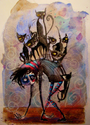 This word was hard!! I was stumped. I looked up several thesaurus listings and googled images in hopes of inspiration and found a lot of briefcases. Ick! After letting it sink in a bit I decided to focus on the burden or inconvenient connotations of the word"liability"and how I personally feel when I think about legal jargon or a disadvantage. Thusly, we have a pile of pointy angry cats.
Sunday, April 4, 2010
Neato Exhibit -->"A Torrent of Words"

"Can You Fix It So My Stuff Looks Good?" by Wayne White
Thursday, April 1, 2010
Weekly Illustration: Habit
Thursday, March 25, 2010
[Project 2: Waking Hours]
*Disclaimer: These diary pages include some filthy language my mother would be ashamed of. *
 This is the first of the daily recordings, I had a piece of graph paper in my pocket at work. I wanted to record at least one day at the restaurant--my manager was very cool about pretending not to notice me scribbling. I chose an elongated format in an attempt to better describe the passage of time--I'm using a calendar format in an artist book class I'm currently taking and thought it might be interesting to translate that to some illustration work. The figures are really REALLY simple, but I think the body language is still effective even though the mark making is pretty conservative.
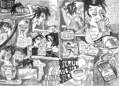 I decided to approach the second recording attempt differently: It's less about the passage of time and more of a montage-- trying to create a cohesive final composition that describes the overall vibe of the day. This series of drawings was completed over a whole day of doing homework in the studio and housework, thus they are a little more complicated than the previous effort. {Page 1 left to right: 11:00AM, 11:15AM, 12:00PM, 1:00PM, 2:PM, 2:30PM, 3:00PM Page 2 left to right: 4:00PM, 5:00PM, 6:00PM, 7:00 PM, 8:00 PM, 9:00PM}
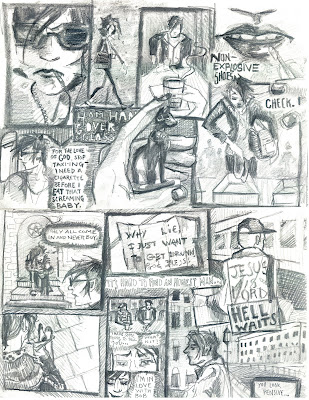 This recording attempts to combine both the passage of time and the usage of multiple "camera angles". I wanted to experiment with different viewing points as well as incorporate inanimate objects and pieces of the environment instead of simply translating conversations. This particular recording describes my day trip to Salem, MA starting with a 4 AM flight out of Milwaukee. {Left to right: 4:30 AM, 5:00 AM, 6:00 AM, 7:00 AM, 8:00 AM, 12:00 PM, 1:00PM, 1:45PM, 3:00 PM, 4:00PM, 7:00 PM, 8:00PM.}
[Tuesday 3/9/10]
 This is the first of the daily recordings, I had a piece of graph paper in my pocket at work. I wanted to record at least one day at the restaurant--my manager was very cool about pretending not to notice me scribbling. I chose an elongated format in an attempt to better describe the passage of time--I'm using a calendar format in an artist book class I'm currently taking and thought it might be interesting to translate that to some illustration work. The figures are really REALLY simple, but I think the body language is still effective even though the mark making is pretty conservative.
[Saturday 3/13/10]
 I decided to approach the second recording attempt differently: It's less about the passage of time and more of a montage-- trying to create a cohesive final composition that describes the overall vibe of the day. This series of drawings was completed over a whole day of doing homework in the studio and housework, thus they are a little more complicated than the previous effort. {Page 1 left to right: 11:00AM, 11:15AM, 12:00PM, 1:00PM, 2:PM, 2:30PM, 3:00PM Page 2 left to right: 4:00PM, 5:00PM, 6:00PM, 7:00 PM, 8:00 PM, 9:00PM}
[Saturday 3/20/10]
 This recording attempts to combine both the passage of time and the usage of multiple "camera angles". I wanted to experiment with different viewing points as well as incorporate inanimate objects and pieces of the environment instead of simply translating conversations. This particular recording describes my day trip to Salem, MA starting with a 4 AM flight out of Milwaukee. {Left to right: 4:30 AM, 5:00 AM, 6:00 AM, 7:00 AM, 8:00 AM, 12:00 PM, 1:00PM, 1:45PM, 3:00 PM, 4:00PM, 7:00 PM, 8:00PM.}
For the final recording, I tried to focus on integrating the text as part of the composition instead of using it as a descriptor, as well as including multiple camera angles and scenery (graffiti, architecture, elevator interiors, etc.) to better describe the story and mood. This is my personal favorite of the group--an account of my partner Alex's an my day trip to New York to see the Tim Burton exhibition at MoMA--I feel like the ideas I was playing with start to coalesce a bit. It deluged the entire time we were there which allowed for coffee shop and sub-way-ride-downtime to capture images in the moment. {Top page clockwise: 11:00 AM, 12:00PM, 2:00PM, 3:00PM, 4:00 PM, 5:30 PM. Bottom page clockwise: 6:30 PM, 8:00PM, 9:00PM, 10:00PM, 10:30PM.}
Tuesday, March 9, 2010
[Project 2: What?]
So we're supposed to make fifteen sketches a day outlining our doings--uh, if I didn't work 9 hours a day 6 days a week and had no other classes this might be fun. Slash that, not fun, POSSIBLE. Hope everyone is looking forward to 60 stick illustrations of a cranky b**** flipping burgers. I know I know, all sorts of fabulous illustrators and successful comic artists keep visual diaries, and that if I were a good artist I would too-- but I highly doubt these people have the time or the energy to record every minute detail of their waking hours in ink. Even if they did, I don't think I'd care to read it.
Who knows... maybe it'll be like American Splendor. I'll do it. I'm not going to like it. But I'll do it...
Best of luck guys!
I know your day sucked.
Mine did too.
Sigh.
Mine did too.
Sigh.
Who knows... maybe it'll be like American Splendor. I'll do it. I'm not going to like it. But I'll do it...
Best of luck guys!
Sunday, March 7, 2010
[Thoughts on Comics]
"Comics are a unique art form, not a genre..." I'd never considered that--that each comic functions on it's own in a different way, that the reader must exert effort to interpret the message, to fill in the gaps. I would often think of graphic novels as illustrated movies, but that's untrue. The illustrator must imply the passage of time, depend on static imagery to communicate a gambit of emotions. If comics were like movies, all comics would be flip books...
minimalism. I get sucked into the trap of more is more. I'd forgotten about how effective and sophisticated Charles Schulz' work actually was: he talked about death and loss and joy--HEAVY PROFOUND STUFF with a simple bald kid and couple of scribbly lines. The lines that are presented are purposeful, the use of gesture is strong and the raw material of the story is deceptively compelling and truthful.
minimalism. I get sucked into the trap of more is more. I'd forgotten about how effective and sophisticated Charles Schulz' work actually was: he talked about death and loss and joy--HEAVY PROFOUND STUFF with a simple bald kid and couple of scribbly lines. The lines that are presented are purposeful, the use of gesture is strong and the raw material of the story is deceptively compelling and truthful.
Thursday, March 4, 2010
Friday, February 26, 2010
Monday, February 22, 2010
Neighborhood Portraits


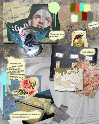
My goal for this triptych was to illustrate the casual and eclectic nature of my urban neighborhood: describe the colors of the houses on my street, the textures in my building, the signage on the sides of restaurants, the graffiti scrawled on the dumpsters.
I like to think of each collage as a little visual poem about my surroundings.
It was important to me that each collage be able to stand alone and still work as a cohesive group when viewed together. (Thus, the repeating elements of target shapes, birds, central composition and color scheme.) I began this project by paying special attention on my walks home from work, making lists and snapping photographs. Each composition is a combination of my own photographs and found images:
 [Watertower Collage]
The Watertower collage includes a beautiful piece of East Side architecture, the North Point Watertower. I remember viewing it as a child, squinting at it past the sun and and being told that Rapunzel lived there. Other East Side images include a dirty mattress I photographed last spring, the window well view of a packed basement, and prayer flags fluttering from a neighbor's porch. The pallets for all three collages are drawn from the shutters, signage, mailboxes and siding seen on my street.
 [Pabst Blue Ribbon Collage]
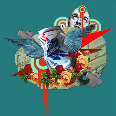
Though it hardly constitutes as beer, PBR has become a cult classic. You can see the red and blue can painted on the facades of buildings or crumpled up and covered with frost on your front lawn. I decided to pay homage and poke fun at the hometown favorite while including images of my 100-year-old apartment building's cream city brick exterior and a favorite fading wheat-paste sticker I pass daily.
My building is terrible--falling apart at the seams, water stuck under the tub and rotting windowsills--but we're in love. This particular collage is an ode to my apartment, starring my cracked and peeling door bell. The surrounding images are textures either drawn directly from or inspired by my six unit apartment complex.
Friday, February 19, 2010
Tuesday, February 16, 2010
Research:
[Jenny Dunn] Why I Love It: The work utilizes bright fresh pallets and often includes hand drawn elements to create charming playful collages with lose open compositions. What You'll See: Bunnies, ice cream cones, ephemera and cotton candy colors.
[Julien Pacaud] Why I Love It: These digital collages are built around limited sophisticated pallets and often star cheese-cakey retro images of pancake made-up housewives and saturated vintage furnishings. What You'll See: Teal, harvest gold, lipstick, bold shapes and 60's Chic.
[Christian Northeast] Why I Love It: Peculiar situations and off-putting proportions, just macabre enough to tickle your morbid curiosity but strays far from beating you over the head with the mall goth galleria of blood and guts. What You'll See: Turn of the century imagery, circus poster pallets, dead sailors, bird women and antiquated diving gear.
[Lori Feild] Why I Love It: Ephemeral stage-like narratives swimming in a psychedelic wonderlandia of pastels and patterns. Her works incorporate rich surfaces, collage and hand-drawn elements to create cohesive waking-dream-like environments that juxtapose the oddly uncomfortable and inviting. What You'll See: Girls in chiffon, intricate tattoos, white hares, tiger stripes, and supple sfumato surfaces.
[Ian Miller] Why I Love It: Dark, disturbing, gritty apocalyptic images composed of architectural and figural elements. The texture and motion in these mixed media pieces gives me the heebie jeebies. While some of the drawing and painting work is a little hokey science fiction horror for my taste, the collage based work is disjointed and jarring in the best way possible. What You'll See: Gas masks, decay and the occasional lamb fetus.
Thursday, February 11, 2010
Tuesday, February 9, 2010
Gathering and Planning
 [click for a larger image]
In my wanderings this week, I've been trying to pay close attention. I'm finding an old creative writing prompt strategy to be helpful, constantly thinking to myself: I see, I hear, I feel, I smell...and filling in the blanks. What I've gathered here are loose beginning compilations of images and textures--some directly from the neighborhood and some from outside sources--that act as a sort of stream-of-consciousness impression of my street, building and immediate neighborhood.
Friday, February 5, 2010
Neighborhood Gathering
 I live on the Eastside of Milwaukee--I love it here and wouldn't want to live anywhere else. (Aside from being a better apartment that is...) My grandparents lived here, my dad grew up here and now I wander around and make art here. I've been to lots of beautiful cities and given them my Goldilocks Report: too big, too small, too expensive, too hot, too cold. But my neighborhood next to Lake Michigan in all its trashy-grimy-telephone-pole-staple-studded- glory is home. I like to say that Milwaukee is Chicago's sluttier younger sister: cute, approachable and doable for under $50.
Thursday, January 28, 2010
Craig Frazier
"The minds eye has been activated." I found the most interesting portion of Frazier's article to be his poetic discussion of the importance of the symbol as an almost magical prompt for instant understanding. He explains that a simplistic well designed symbol is superior to a lavish frilly representation--quick retrieval, convenience, genius branding-- yet warns us about being too obvious. Wit is mentioned again and again. Do not clumsily beat your audience over the head. Make your viewer use their gray matter. They will thank you.
Thoughts on Illustration:
How does Illustration differ from Design?
It's embarrassing how little I know about illustration, which was why I felt compelled to take this course in the first place. I'm surrounded by both and it seems strange that as an artist my knowledge is so limited--like living in a foreign country for 10 years and still having no grasp of the local language. I feel that design serves a more formal function (ex: slick product design) and that illustration serves as a more expressive mode of communication (ex: the graphic novel). My immediate knee jerk response to the word design conjures thoughts of fonts and margins, where as my response to illustration is less about text and alignment but more so about lush ideas that require image to be truly absorbed and understood.
What is the Purpose of Illustration?
Personally, I feel that illustration is a way to consolidate the BIG STUFF: experiences, cities, interpersonal relationships into visually pleasing bite-size pieces that can be digested by a viewer.
In your Life, where do you come across Illustration?
Magazine covers, website banners, children's books, adult books, bumper stickers, viral youtube animations, comics I wish I drew and on my walls--my best friends are talented illustrators and I try to collect their work when I can.
Subscribe to:
Posts (Atom)


